Grid
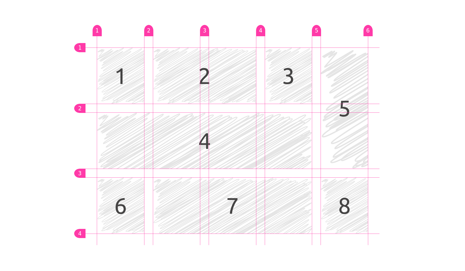
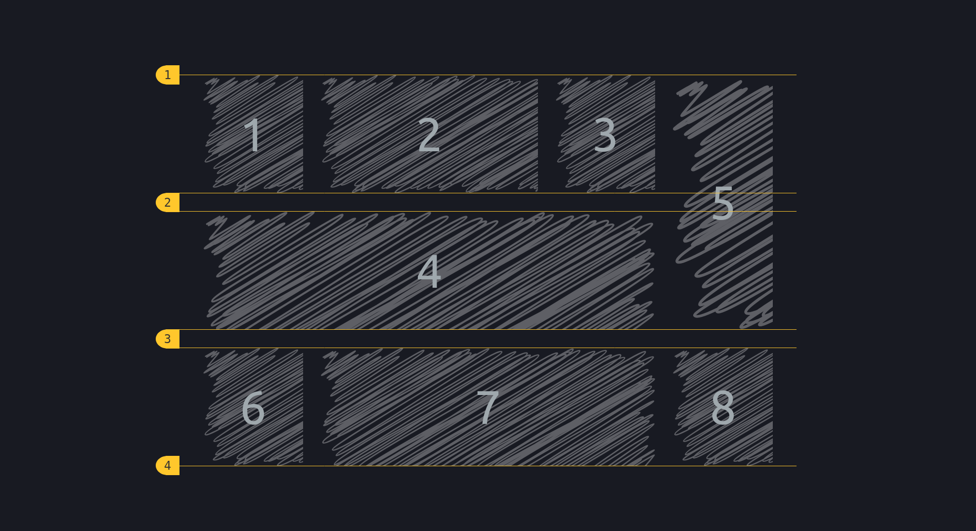
This feature allows you display the grid characteristics, for now only spacing, of an element width display: grid;.
INFO
For more technical documentation, see the relevant documentation under the API-section.
Usage
Via <script>-tag
html
<script src="https://unpkg.com/@phun-ky/speccer/dist/speccer.js"></script>
<div data-speccer="grid" …>…</div>
Programmatically
typescript
import { grid } from '@phun-ky/speccer';

const { create } = grid;
const element = document.querySelector('.my-element');
const options = {
  slug: 'gridTest',
  type: 'grid',
  grid: {
    toggle: 'both' | 'rows' | 'columns',
    both: false | true,
    rows: false | true,
    columns: false | true
  }
};
await create(element, options);
TIP
If you only want to display rows or columns, use this syntax (default is both with grid only):
html
<div data-speccer="grid [rows|columns]" …>…</div>typescript
import { grid } from '@phun-ky/speccer';

const { create } = grid;
const element = document.querySelector('.my-element');
const options = {
  slug: 'gridTest',
  type: 'grid',
  grid: {
    toggle: 'columns',
    both: false,
    rows: false,
    columns: true
  }
};
await create(element, options);
Feature options
For more control over the feature options, you can view the available settings in the reference section.